Use of Wind Rose Diagrams in the Wind Energy Industry

Today we talk about wind rose diagrams and give you an insight of how they’re used in the wind energy industry in order to determine the most suitable location for wind farms. We also give you a sneak peak of the new and greatly improved wind rose diagrams that we’re working on for the upcoming version of Weathercloud, so make sure to give the post a read to have a grasp of what’s just around the corner.
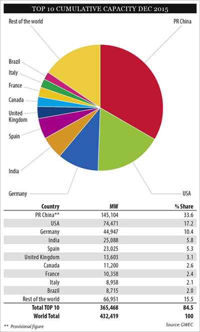
Let’s start with some numbers. Wind is currently the second source of renewable energy just after water. More than 430 GW of wind energy are produced each year globally, with China leading the way with 145 MW, followed by the US with 74 MW. With a global total growth of 17%, wind energy is increasingly used because of its low price, high performance and increased reliability.
Determining the most convenient location for a wind farm usually requires an extensive survey in which a large amount of data needs to be collected and analyzed. One of the most common evaluation methods for this purpose relies on diagrams depicting the average wind speed and direction on a wind rose. These diagrams can tell not only if the wind is strong enough to produce the expected energy, but also how constant it is and what are the predominant wind directions in that specific location, with the latter being a crucial factor in determining the orientation of the turbines.
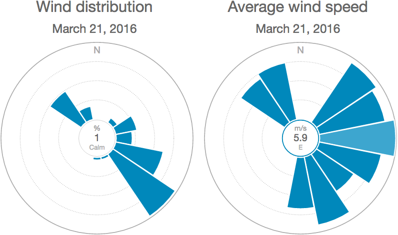
Weathercloud wind rose diagrams allow you to carry out similar studies on a daily basis by showing the wind distribution in % and the average wind speed for each sector. If you hover over a sector, you’ll see the percentage of wind coming from that direction (graph on the left) and the average wind speed for that sector (graph on the right). By combining both diagrams you can calculate approximately how much wind power is available at the location, and adding the power curve of a specific wind turbine to the mix it’s possible to calculate how much wind power is produced.
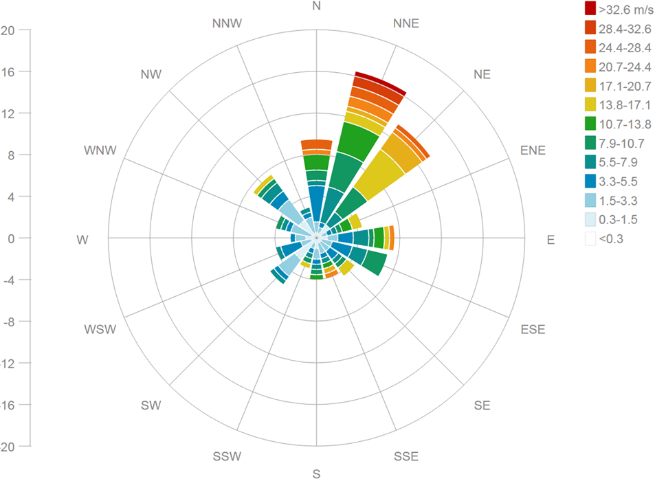
The new wind rose diagrams that we’re working on will display even more information by sorting the wind in different categories according to the Beaufort scale, and then representing all of them with percentages of occurrence. We believe this new tool will be of great help to those requiring extended wind analysis capabilities. Below is a preview of what you can expect from our new and enhanced wind rose diagrams:
We hope you enjoyed this post, and if you did don’t hesitate to leave a comment below!
Thanks and have fun!


Does the new wind rose diagram will display data for a month a week and so on ?
Hi Jean Pierre, the upcoming version of the wind rose diagrams will be highly configurable.
Hi.
Wind distribution rose is not displaying for my weatherstation?
https://app.weathercloud.net/d0562714639#wind
It always displays a wind direction on North.
Regards Lars
Hi Lars, the wind distribution roses require average wind speed data to work properly. Please check the following topic for more information about a weather variable not being uploaded: https://weathercloud.net/site/faq#faq-notallvariables
Seems that Average Wind Speed is working, bus Average Wind Direction is not. So if AWD is not calculated by WeatherCloud, then Wind Distribution Rose will not work. Is that correct?
Yes, that’s right Lars but please note that we do not calculate the average wind direction. It is your weather software that has to send this data to our site.
Great tool in order to make a better analysis, so usefull!
Thanks for sharing!
Glad you like it! :)
Very lucent description. Will windrose for a given wind turbine depict the change in power generated if the location of a particular wind turbine is shifted in view of topography and hydrogeological reason? If it does, is the energy difference impact high?